Hello, hello, welcome to another episode of Joe's Audio Notes.
I am, so this is gonna sound different, I am testing the Shure MV7+ microphone.
Not because I want to replace the SM7B I have, but because I've been recommending this microphone, but I have not actually used it and I got some interesting feedback.
So I picked one up, I'm going to do a video.
I'm told that like it picks up every little kind of knock, which is wild because I grab my microphone stand with the Shure SM7B all the time, so this mic would not work for me.
I don't, I talk with my hands obviously.
Anyway, that's not really what this episode is about.
It just gave me an excuse to test this.
So I started rolling out the rebrand.
This is pretty, I'm gonna do like a full video about it, but I wanted to give y'all, since y'all have been, I've been teasing this for you, I figured I would kind of run through it really quick.
You can also go to casabonan.org/joe-casabonan and see the new homepage, which is using everything.
But I'm just gonna run through what Holly provided and I'll probably do something more formal later in the week when she gets me the like the official brand guideline and graphics and stuff.
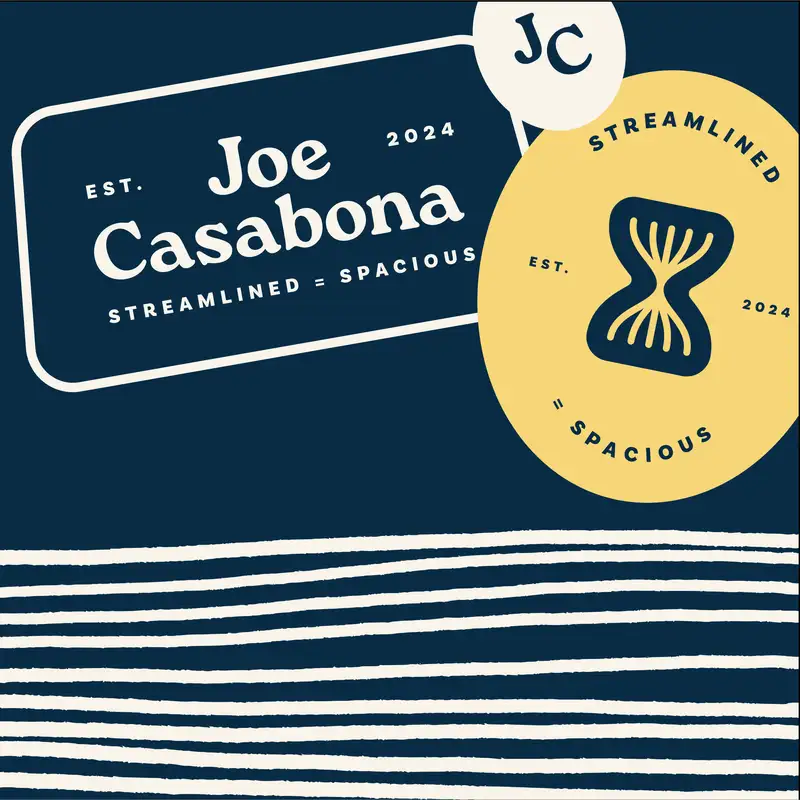
But my vision, she wrote streamlined business systems that enable spacious lives for busy entrepreneurs.
My mission is to create tools and resources that help busy entrepreneurs craft spacious lives through streamlined business systems.
And my brand idea is streamlined equals spacious, which I love.
Streamlined was the word that I came up with for the show for my podcast back in March, but I love the idea of streamlining, like the result or the benefit of streamlining.
So I love that.
The brand should feel, these are words that I think more or less I gave her, helpful, humorous, inviting, humble, honest, approachable, classic, modern, personal, positive.
And then the brand assets are amazing.
If you look at my desk post, the what's on my desk post, casabonan.org/desk, you will actually see most of them there.
I made my wallpaper the brand assets that she provided.
But one of the things that I asked for after the only piece of feedback I had after the first round was like, can we do an icon?
Like some sort of like little icon logo that's not my initials.
Just because like I feel weird.
You know, we landed on personal brand.
This might be more than six minutes.
We landed on personal brand and I'm very happy we did that.
But I still wanted like a logo or an icon not directly associated to me.
And she came up with a play on the hourglass that my old designer from Design Pickle, Buddy, came up with.
But instead of like just three hour arrows going up through the hourglass, it's these lines that converge in the middle.
They're kind of like bi-directional and I love it.
It looks amazing.
You can actually see it.
I started to roll this out and so I redid the Streamline Solopreneur artwork.
So if you look at the Streamline Solopreneur podcast art, you'll see the the icon I'm talking about.
But I love it.
Primary typeface for the brand is Roca.
Beautiful.
It's an Adobe font.
I like happily paid for it.
It looks amazing.
And then the secondary and support copy are both Geologica.
We had something else but that would have cost like a lot of money for me to get the licenses to everything.
And she ended up finding a Google font that looked nearly identical to it.
So Geologica is what we went with and I'm really happy about that because it saved me money.
But I think it looks amazing.
I rolled the fonts out on casabona.org and everything looks so much better.
Even though I'm a web designer or a web developer of 20 years, I would never spend the requisite amount of time on fonts that I needed to to really make them work.
And that just tanked from the time I really started.
For my own projects, but also just from the time I stopped doing web projects.
So finding these pairings that she did, it just looks so much better.
And then the color scheme she came up with, awesome.
It's like softer versions of the colors that were picked for the original Streamline Solopreneur rebrand.
But she also assigned names to each of them which I love.
So the three primary colors are this really nice navy.
Not a super light yellow, darker than a post-it, but not all the way yellow.
And then this like off-white.
And the navy is labeled process, the yellow is labeled streamline, and the off-white is labeled space.
And I just I like that because it really adds some like reasoning to the colors and how I would use them.
And then she just provided some kind of this is how it'll look in the real world.
But I'm so happy with it.
It looks so much better.
I can't wait to get new headshots with like my new baseball cap using the logo and really like roll this out.
I'm gonna roll it out over time, but you can already start to see it over on casabona.org.
And again I'll share that homepage, which I might just switch over today.
So I'll do like, because like it's already like mostly redesigned.
Like again the fonts and the colors are changed, but it's just the homepage is not different and I really haven't announced it yet.
I want to like review the navigation and I've come up with like these three service areas that I really want to nail down first.
But like that and streamlines.fm have started to get the new branding.
And so I'm really just really pleased with the way everything has turned out.
And of course Holly's gonna get me the the brand guidelines and the graphics so I can start rolling them out on socials.
So I'm probably not gonna officially announce until that.
I might try to like kind of fake a headshot in the meantime until I can book my photographer again.
But I just wanted to give you a kind of quick walkthrough of it and how happy I am with it.
Maybe I'll link to some of the assets in the show notes, but I'd love to hear your feedback.
Oh also you'll notice that the artwork for this has changed to be more in line with the brand.
So you can see like the font is Roka.
And then I didn't mention this but like she has these through lines kind of like the pattern are these uneven lines.
But it's like the way she explained it was kind of like this is you know it's like this is you kind of looking over your processes and streamlining.
And I just really like that.
It's a really cool pattern and so I'm trying to integrate it everywhere I can.
And so you'll see that and then you'll see the my monogram that she came up with on the hat now.
So that's it for this longer than normal episode.
I'd love to hear your thoughts on the brand.
Also what you think of the microphone if it sounds weird.
I'm tapping my desk right now.
I'm tapping the base of the stand right now.
I'm tapping the pole right now.
And I'm tapping the back of the mic right now.
So we'll see how that sounds.
And until next time I'll see you out there.